Reference
Compare table — five locations, side by side
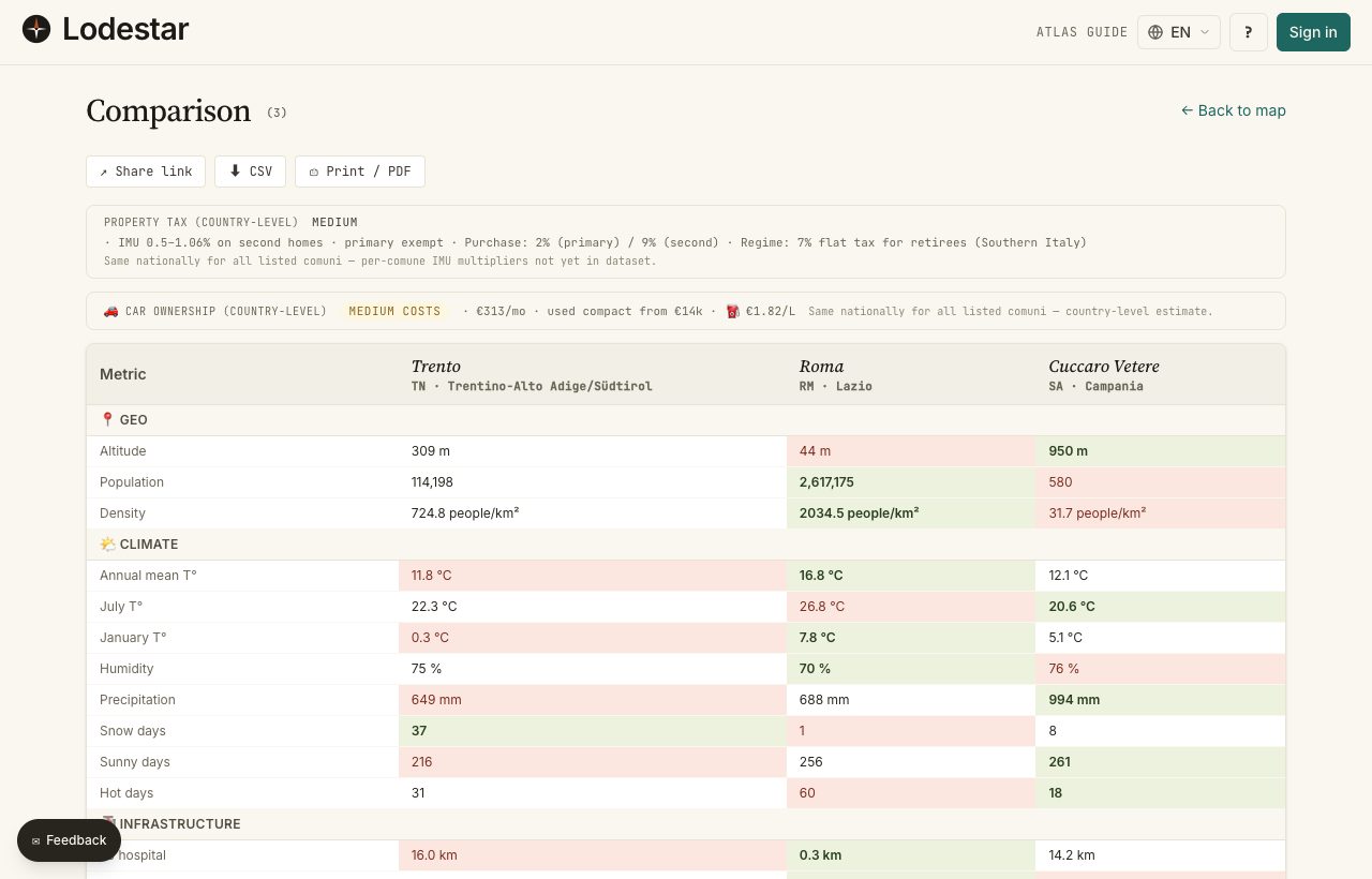
You open the compare table when the shortlist is too long to argue about. Up to five locations as columns, twenty-two metrics as rows. Best in each row goes green, worst goes red, and the direction is baked into the metric so you do not have to think about it.
Where to find it
Three ways in. From the details panel, hit ⊞ Compare on each location: a floating bar at the bottom collects them, and "Compare →" opens the table. From the shortlist drawer: check the rows you want, then ⚖ Compare. Or arrive by someone else's compare URL — the table just opens.
How it works
The cap is 5 locations. Adding a sixth pushes the oldest one out; the bar warns you before that happens. The table itself has 22 rows grouped by category: geography, climate, infrastructure, internet, taxes, demographics.
Reading the highlights
In each row, the best value is green and the worst is red. "Best" depends on the metric. For hospital distance, shorter wins, so the lowest number is green. For sun days, higher usually wins, so the highest is green. Direction is fixed per row; you do not configure it.
What you can do with the table
- Copy link — packs the location IDs into the URL. Send it to a partner, an estate agent, or your future self in two weeks.
- Export CSV — the same data as a spreadsheet: row per metric, column per location.
- Print / PDF — your browser's print dialog. The table re-flows to fit an A4 page.
- Open in details — click a column header to jump into the details panel for that location.
What to keep in mind
The table works one country at a time. The compare bar itself does not enforce this — you can technically queue locations from different countries — but the table is structured around the metrics of a single country. Cross-country comparisons live in the Atlas, not here.
Frequently asked
Why is green sometimes the higher number and sometimes the lower?
Every metric has a baked-in "good direction". Shorter for distances. Warmer for January temperature in most use cases. Higher for sun days. You cannot flip the direction per session — if your priority is the opposite, just read the red cell as the green one.
Can I compare more than five locations?
Not in one table. The horizontal layout falls apart past five columns: you would scroll sideways and lose the row labels. For a bigger candidate pool, narrow to five first using filters and shortlist notes.
Can I add custom rows for my own metrics?
Not in the table itself. The closest thing: export the CSV and add your own columns in a spreadsheet.
My shared link does not show the same locations to my partner.
The link encodes locations by ID. If their country selection is different, or their language preference points elsewhere, the table renders slightly differently. Location IDs are stable across both; the underlying data shape is the same.
Verified · 2026-05-26